

Giới thiệu thông tin về thư mục Resources trong android

Drawable là nơi chứa tài nguyên về âm thanh, hình ảnh, selector …chúng được truy xuất từ class R.drawable Khi các bạn sử dụng các Widgets có sẵn của android thường các bạn phải chấp nhận về hình dạng và hiệu ứng của nó. Vì vậy muốn ứng dụng của mình lung linh hơn đẹp hơn các bạn phải sử dụng selector. Sau đây mình sẽ hướng dẫn các bạn tạo selector
Ở bài hướng dẫn về ứng dụng đầu tiên tôi đã giới thiệu cho các bạn màn hình làm việc của android studio bài hôm nay tôi sẽ đi giới thiệu chi tiết hơn cho các bạn thư mục Resources. Resources là nơi chứa mọi tài nguyên tĩnh của ứng dụng như sounds, pictures, colors… Ứng dụng muốn truy xuất tài nguyên phải thông qua lớp này bằng hàm getResources (). Sau đây tôi sẽ đi sâu vào từng tài nguyên và cách truy xuất dữ liệu.
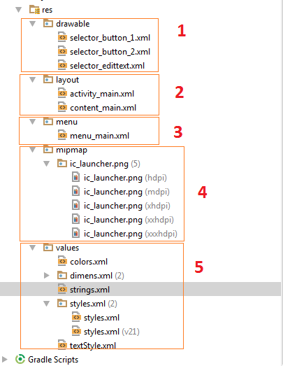 1. drawable: hướng dẫn sử dụng selector.
Drawable là nơi chứa tài nguyên về âm thanh, hình ảnh, selector …chúng được truy xuất từ class R.drawable Khi các bạn sử dụng các Widgets có sẵn của android thường các bạn phải chấp nhận về hình dạng và hiệu ứng của nó. Vì vậy muốn ứng dụng của mình lung linh hơn đẹp hơn các bạn phải sử dụng selector. Sau đây mình sẽ hướng dẫn các bạn tạo selector
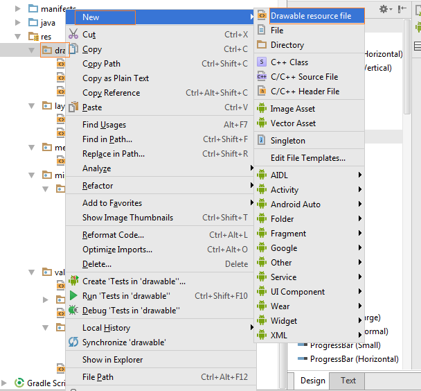
Các bạn kích phải chuột vào thư mục drawable/New/Drawable resource file.
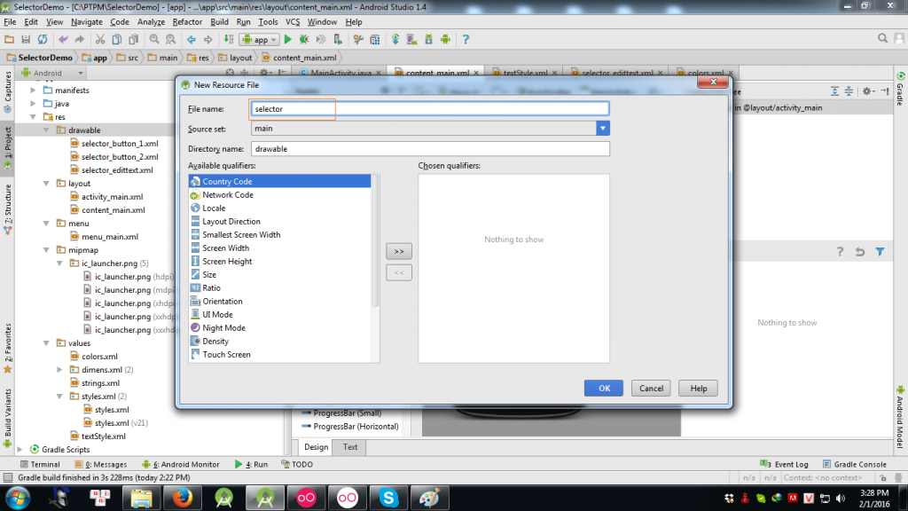
Sau đó các bạn đặt tên cho file selector của mình.
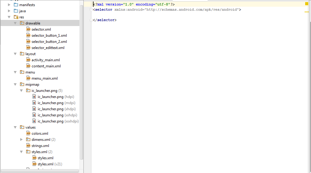
Như vậy là các bạn đã có 1 selector bây giờ chúng ta bắt đầu đi custom selector cho riêng mình. Ở đây tôi dùng selector kết hợp với shape
Chỗ tô đậm là cho phép hiệu ứng nhấn xuống, ở đây có 2 item, item phía trên là ảnh của button khi ấn xuống còn item 2 là ảnh của button lúc mặc định.
|
1
|
<corners android:radius=”10dp”></corners>
|
Dòng này thể hiện button sẽ bo góc là bao nhiêu, ở đây là bằng 10dp
|
1
|
<stroke android:width=”1dp” android:color=”@color/colorGreen”></stroke>
|
Dòng này thể hiện viền của button dầy bao nhiêu và có màu gì.
|
1
|
<solid android:color=”@color/colorRed”></solid>
|
Dòng này thể hiện màu của button là gì, phần @color/colorRed các bạn sẽ được giới thiệu phần color bên dưới.
Cách dùng selector chỉ đơn giản là ta xét background cho button
|
1
|
android:background=”@drawable/selector_button_1″
|
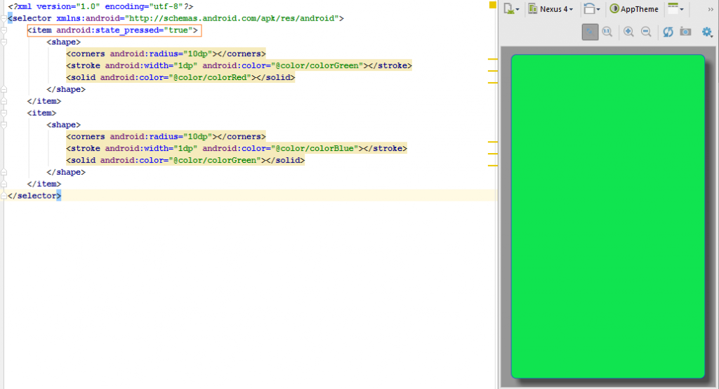
Các bạn có thể tham khảo file XML của mình
|
1
2
3
4
5
6
7
8
9
10
11
12
13
14
15
16
17
|
<?xml version=”1.0″ encoding=”utf-8″?>
<selector xmlns:android=”http://schemas.android.com/apk/res/android”>
<item android:state_pressed=”true”>
<shape>
<corners android:radius=”10dp”></corners>
<stroke android:width=”1dp” android:color=”@color/colorGreen”></stroke>
<solid android:color=”@color/colorRed”></solid>
</shape>
</item>
<item>
<shape>
<corners android:radius=”10dp”></corners>
<stroke android:width=”1dp” android:color=”@color/colorBlue”></stroke>
<solid android:color=”@color/colorGreen”></solid>
</shape>
</item>
</selector>
|
2. layout
Là nơi chứa tất cả các file XML giao diện người dùng, chúng được truy xuất từ class R.layout.
3. menu
Là nơi chứa các file xml định nghĩa menu của ứng dung, có thể là Options Menu, Context Menu, Sub Menu, chúng được truy xuất từ class R.menu.
4. mipmap
Đây là nơi chứa icon của ứng dụng, chúng được chia kích thước khác nhau theo tỉ lệ màn hình khác nhau.
Xem thêm:Tài liệu tu hoc lap trinh android cho người mới bắt đầu
5. values
Thư mục values chứa các file định nghĩa về string, color, style. Sau đây mình sẽ giới thiệu chi tiết và cách sử dụng.
string: Là nơi chứa các đoạn text, các bạn có thể viết trực tiếp trong xml nhưng với những text dùng chung thì ta nên dùng string để dễ quản lý, thay đổi và bảo trì. Ví dụ các bạn có 1000 text “I am coder”, nếu muốn sửa thành “I love code” thì bạn sẽ phải sửa 1000 lần nhưng nếu dùng string bạn chỉ cần thay đổi 1 lần.
|
1
2
3
4
5
6
7
8
|
<resources>
<string name=”app_name”>SelectorDemo</string>
<string name=”action_settings”>Settings</string>
<string name=”selector1″>selector1</string>
<string name=”selector2″>selector2</string>
<string name=”selector3″>selector3</string>
<string name=”selectorDemo”>Demo Selector</string>
</resources>
|
Cách sử dụng string
|
1
|
android:text=”@string/selector1″
|
color: Là nơi mình khai báo những mã màu mình hay dùng, cũng như string mình có thể định nghĩa và thay đổi code một cách nhanh nhất.
|
1
2
3
4
5
6
7
8
9
10
11
|
<?xml version=”1.0″ encoding=”utf-8″?>
<resources>
<color name=”colorPrimary”>#3F51B5</color>
<color name=”colorPrimaryDark”>#303F9F</color>
<color name=”colorAccent”>#FF4081</color>
<color name=”colorBlue”>#1736e2</color>
<color name=”colorGreen”>#10e450</color>
<color name=”colorRed”>#e7155c</color>
<color name=”colorViolet”>#c004ef</color>
<color name=”colorYealow”>#ecf906</color>
</resources>
|
Cách sử dụng color
|
1
|
android:color=”@color/colorRed”
|
style: Theo như nghĩa đen thì là phong cách nhưng ở đây mình định nghĩa những control có những đặc điểm giống nhau sẽ dùng chung 1 style, sẽ tiết kiệm số dòng code. Các bạn tạo 1 file style tương tự như tạo selector nhưng tạo trong thư mục values sau đó các bạn cấu hình style cho phù hợp. Các bạn có thể tham khảo file XML của mình.
|
1
2
3
4
5
6
7
|
<?xml version=”1.0″ encoding=”utf-8″?>
<resources>
<style name=”TextStyle”>
<item name=”android:textColor”>@color/colorRed</item>
<item name=”android:textSize”>25sp</item>
</style>
</resources>
|
Cách dùng style: các bạn thêm dòng code dưới trong file XML của layout.
|
1
|
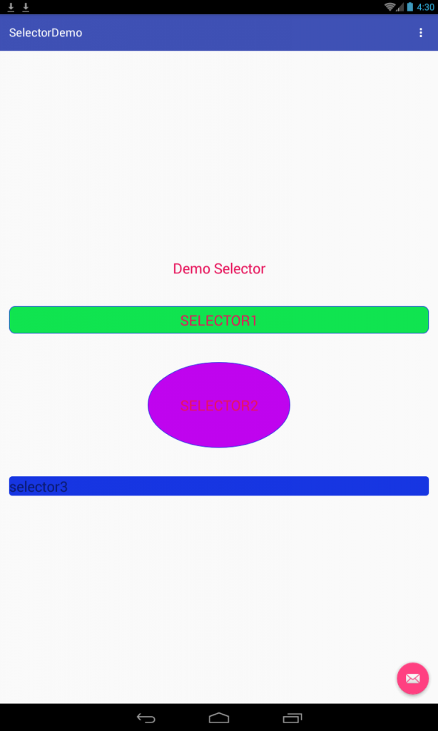
Các bạn tham khảo file xml của mình nhé, và đây là kết quả thu được.
|
1
2
3
4
5
6
7
8
9
10
11
12
13
14
15
16
17
18
19
20
21
22
23
24
25
26
27
28
29
30
31
32
33
34
35
36
37
38
39
40
41
42
43
44
45
46
47
|
<?xml version=”1.0″ encoding=”utf-8″?>
<LinearLayout xmlns:android=”http://schemas.android.com/apk/res/android”
xmlns:app=”http://schemas.android.com/apk/res-auto”
xmlns:tools=”http://schemas.android.com/tools”
android:layout_width=”match_parent”
android:layout_height=”match_parent”
android:orientation=”vertical”
android:paddingBottom=”@dimen/activity_vertical_margin”
android:paddingLeft=”@dimen/activity_horizontal_margin”
android:paddingRight=”@dimen/activity_horizontal_margin”
android:paddingTop=”@dimen/activity_vertical_margin”
app:layout_behavior=”@string/appbar_scrolling_view_behavior”
tools:context=”.MainActivity”
android:gravity=”center”
tools:showIn=”@layout/activity_main”>
<TextView
android:gravity=”center”
android:text=”@string/selectorDemo”
android:layout_width=”fill_parent”
android:layout_height=”wrap_content” />
<Button
android:background=”@drawable/selector_button_1″
android:layout_width=”fill_parent”
android:layout_height=”wrap_content”
android:layout_marginTop=”50dp”
android:text=”@string/selector1″/>
<Button
android:background=”@drawable/selector_button_2″
android:layout_width=”250dp”
android:layout_height=”150dp”
android:layout_marginTop=”50dp”
android:text=”@string/selector2″/>
<EditText
android:background=”@drawable/selector_edittext”
android:layout_width=”fill_parent”
android:layout_height=”wrap_content”
android:layout_marginTop=”50dp”
android:hint=”@string/selector3″/>
</LinearLayout>
|
Các bạn chịu khó xem nhé vì thứ tự của color, string, style nó ở dưới, chúc các bạn thành công!
Cùng Danh Mục:
Liên Quan Khác


Leave a Reply